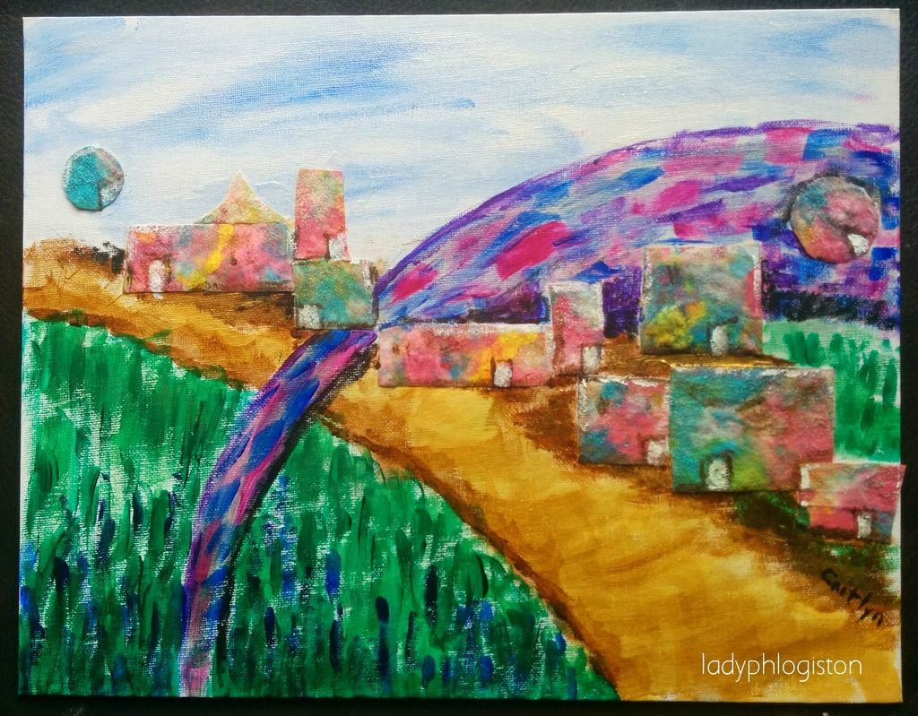
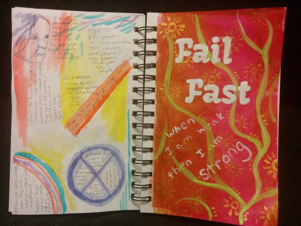
I feel like I’ve been incredibly prolific lately, but when I went to look at things apparently not. Maybe I’ve just been prolific for a mother of two small children. Or maybe it’s all been in my head. I do spend a lot of time building castles in the air.
(I’ve been thinking about faith recently, and how if God can and will move mountains for those who have faith, it seems rather redundant to invent bulldozers and whatnot. I’m coming to the tentative conclusion that God sees science as a form of art, that we’re all building castles in the air. It’s an interesting idea to play with.)
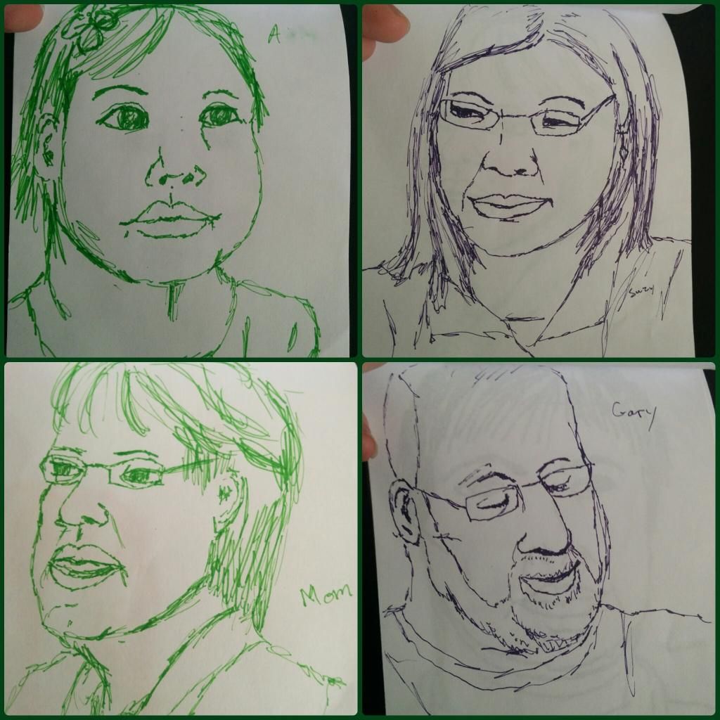
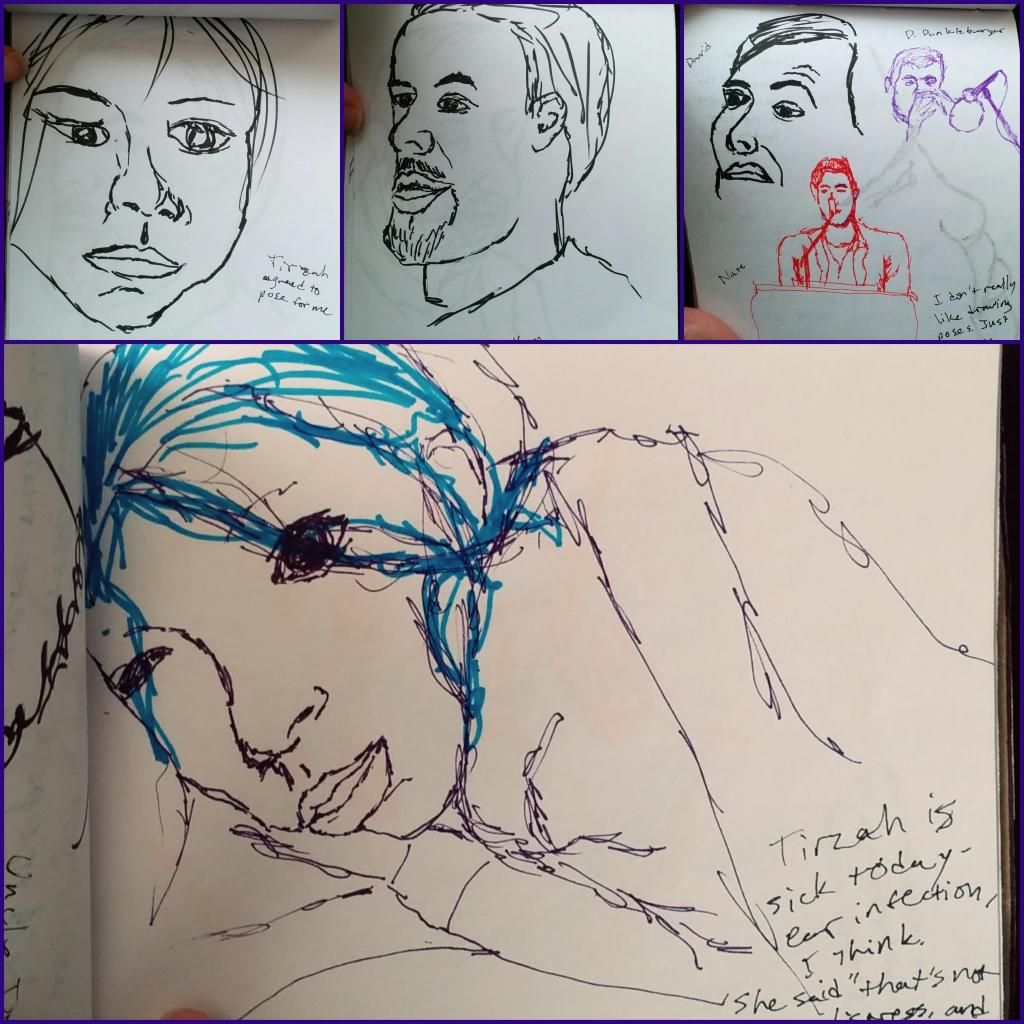
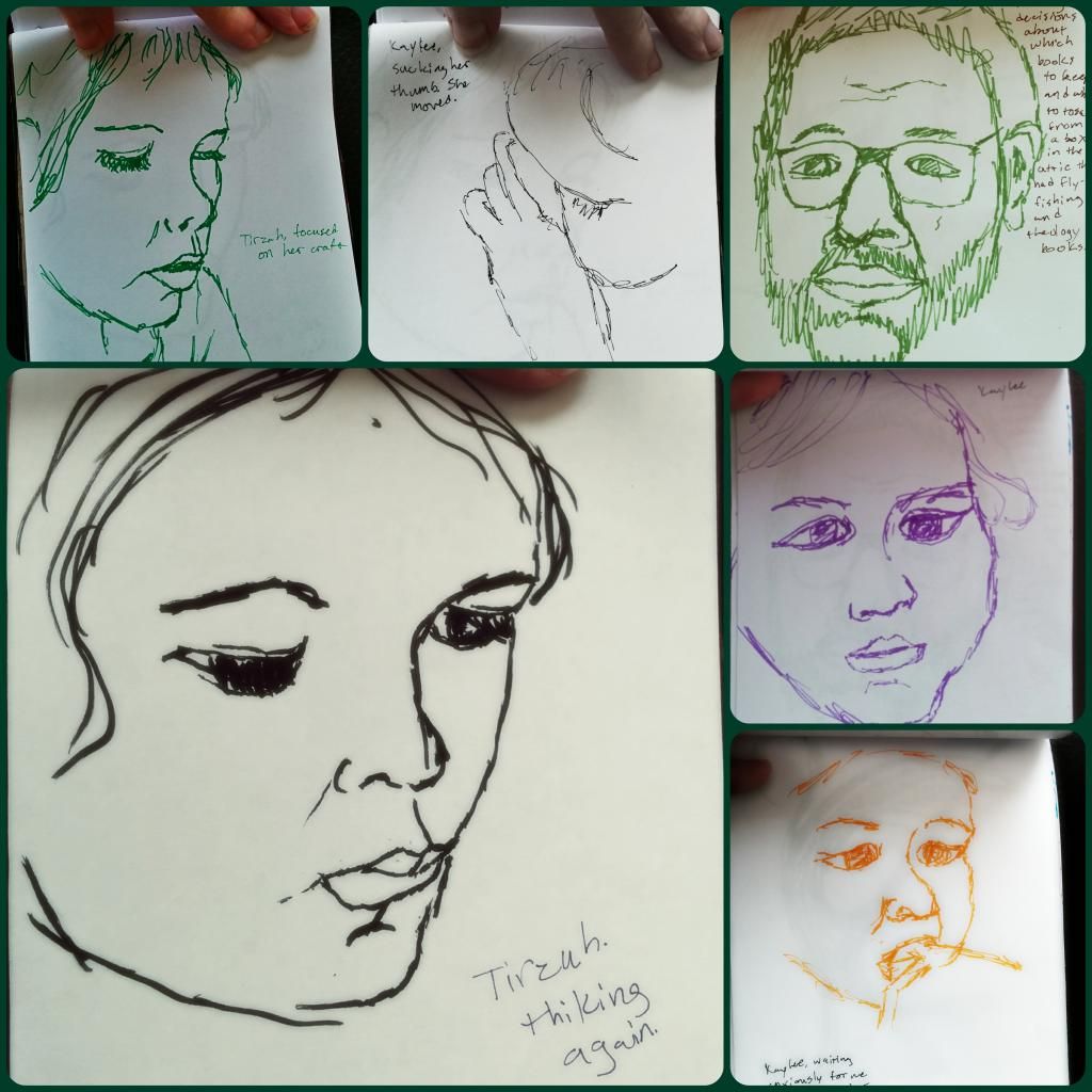
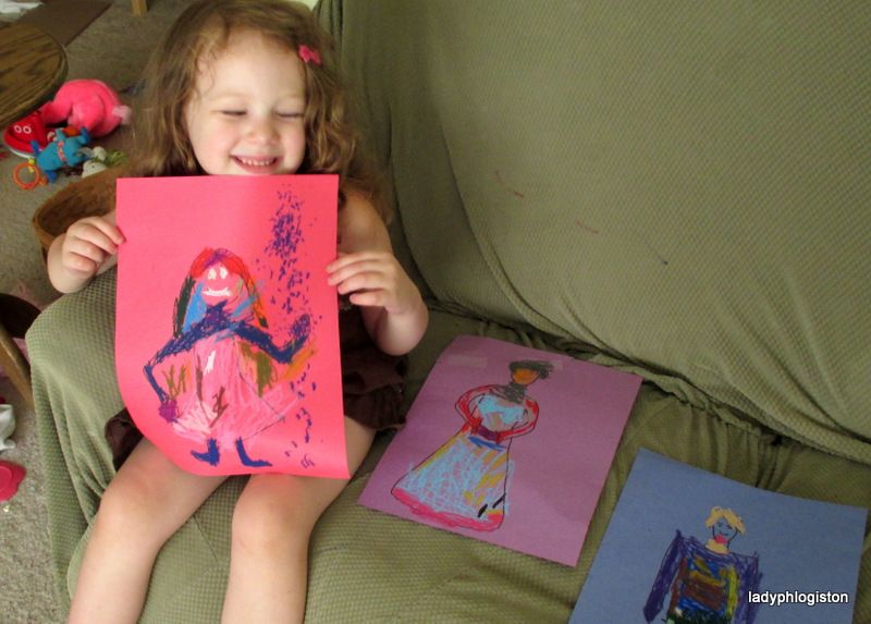
The other element is that even if I am not prolific, my children are. Beauty suddenly figured out that cutting is fun, and she spends a good part of every day cutting magazine pages into bits, with Kitten gamely trying to imitate her. They both spend a lot of time drawing, and they use oil pastels and paints as often as they can persuade me to pull them out.
It’s actually gotten to the point that that pastels and paints were getting undervalued – Beauty would spend a few minutes on each one before demanding the next, leaving me tired and frustrated. It left her tired and frustrated as well, since having me entertain her meant that she spent less time daydreaming, which meant that she didn’t really process the day’s stresses. (She gets that from my side of the family – we process the day and release stress by walking in circles and daydreaming. Looks a bit odd, but it is completely necessary.) So I’m saying “no” more often now to requests for art supplies and projects. She has ready access to drawing and cutting, but I won’t pull other supplies out every day.
Kitten seems to use drawing and painting as a way to calm herself when she is scared or overwhelmed, which is fascinating to see in a two-year-old. A couple weeks ago, her music teacher pulled out a French horn and it was Very Scary. She sobbed and clung to me as I walked with her in the back of the room, and then she asked for “painting.” I didn’t have paint, of course, but I asked if drawing would be okay and got out pen and paper. She spend quite a while leaning on me, carefully watching and then carefully making marks on the paper. Since then I’ve noticed several times when she has asked to draw as a way to calm herself.
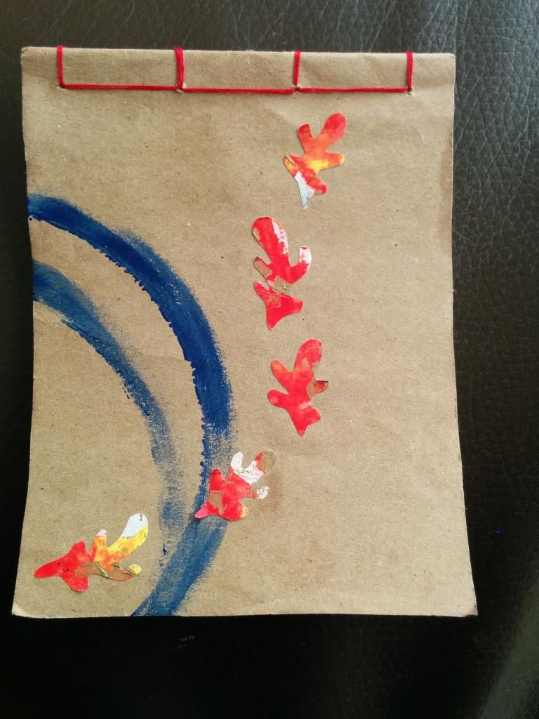
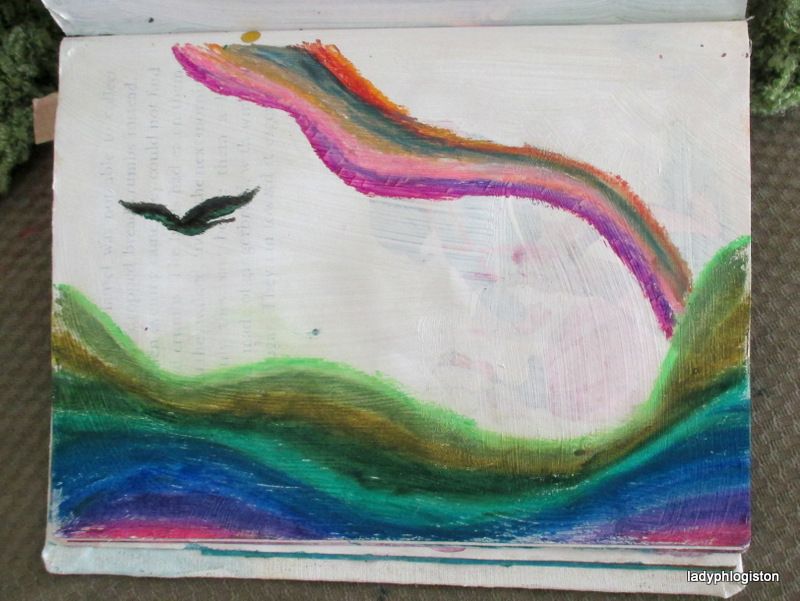
Anyway, here are all the cards we made in roughly a two-week stretch:

Those are mostly watercolor, but there’s craft paint and glitter glue and things as well. (I’ve been using tube watercolors, which let me give them just one or two colors at a time. Interestingly, Beauty is the one who invariably mushes all the colors together, and Kitten is more likely to keep them separate-ish.) I masked off the borders of each card to give them a more finished feel, and sometimes I put in a background as well.
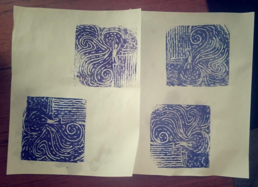
The pink one with a purple circle is one of Beauty’s attempts at printmaking, which she loves. That one was done with scratch foam (did you know that foamcore board from the dollar store can be used as scratch foam? you just pull the paper off) but she’s also glued pieces of craft foam to cardboard to make stamps.
The yellow one with blue and orange suns is an attempt I made at screenprinting. I used fabric from a piece of very cheap lingerie that was in my closet. I must have gotten it somewhere, but I have no idea when or why. At any rate, it will provide quite a lot of screenprinting material for when I want to experiment. I just painted the design on with gesso and it came out pretty well, though getting the consistency of the paint right isn’t easy.
And then the red and blue one in the lower left-hand corner is something of a collaboration between Kitten and me. I cut up a random painted paper as a background for her and let her paint on top, and I love the way it came out! Whether by accident or design, she’s come up with some really nice compositions.
I also did these:


The roses are a stencil I designed and cut from a transparency – I love how they came out! I had a couple others that I used as Mother’s Day cards. The upper one uses metallic copper and pearl paints, so of course the photo doesn’t convey the full effect.
“Baby come back” is, I think, one of my most successful collages ever, though admittedly that’s not saying much ;) It uses paper that was monoprinted using a plastic plate and a q-tip. One of these days I am determined to try gelatin printing.

Prints made with scratch foam from a piece of foamcore board. I didn’t have a brayer (though I’ve since acquired one) so the paint got rather uneven, but I kinda like the design. I sent one to my slightly-crazy Great Aunt Lee, which pleased her very much.

Beauty, done in oil pastels on grocery bag paper. Grocery bag paper didn’t work with oil pastel as well as I thought it would, but such is life. I traced the outlines from a photo (I know my art teacher in the one college course I took said to never draw from a photo, but I’m never going to get her to sit still long enough to sketch) and am reasonably pleased with it as a first attempt. I did the hair wrong, but I’ll do it better next time. I’d like to do some more and get a little better at them and then do some crazy-colored Expressionist ones.

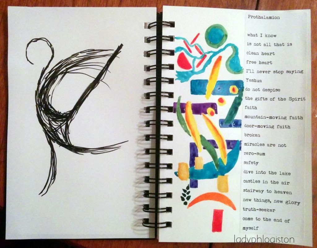
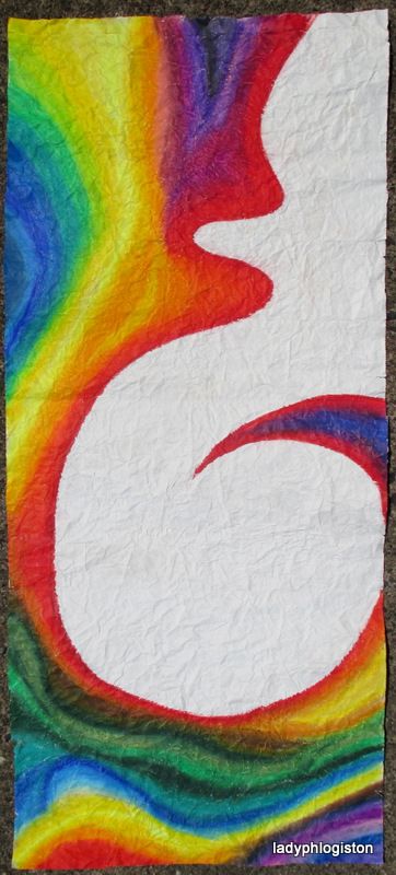
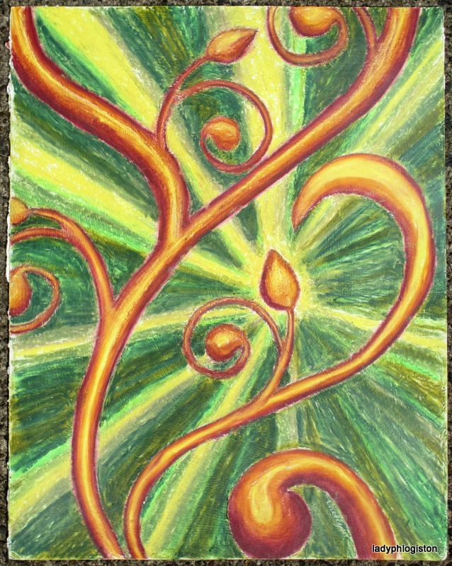
And this one I love. My best friend from college texted me on Thursday to let me know she’d be in town that weekend, so I invited her to my house for breakfast (she was just passing through and could only do breakfast, and Hero couldn’t take the girls then so I figured cooking pancakes and eggs would be easier than keeping the girls entertained at a restaurant or cafe) and rushed home to make her some art. The design is the blown-up Vivant design, just like the one I did in all oil pastels for my sister. The background is tube watercolor mixed with acrylic medium (I don’t have an acrylic blue that transparent) and the flourish is oil pastel. She loved it, and I was so pleased.
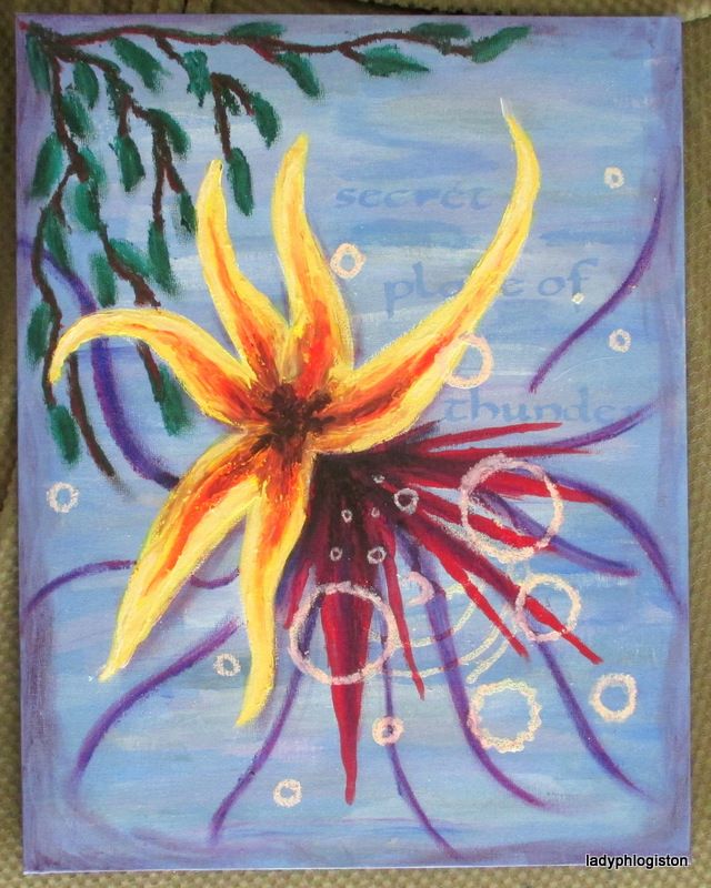
I find it interesting that people see it and assume it is a plant or flower, but my brain stubbornly insists that it is abstract. I don’t know why, but I guess it’s because I started with the abstract swirl and added the plant-y bits later. Brains are funny sometimes.